Shajara Tea
Bringing the richness of Sri Lankan tea to a new market.
- Client
- Shajara Tea
- Industry
- F&B / Premium Ceylon Tea
- Role
- Brand Designer & Creative Director
- Year
- 2025
- Services
- Brand IdentityPackagingArt DirectionSocial MediaContent Creation
A Sri Lankan tea brand with an Arabic soul — designed for a new generation.
Shajara is Ceylon black tea made for the Middle East. The identity had to feel Arabic and elegant, while leaving no doubt about where the tea is grown.
Rooted in heritage. Built for a new market.
Shajara needed to carry its Sri Lankan origin while feeling relevant, elegant and premium to a Middle Eastern audience.
The brief was never to make the brand simply look Arabic. It was to find one visual language where three things could sit together naturally.
From a single leaf to a whole world.
- 01Research
- 02Strategy
- 03Brand identity
- 04Packaging
- 05Content
- 06Social
A completebrand experience.
An identity inspired by nature, culture and craftsmanship.
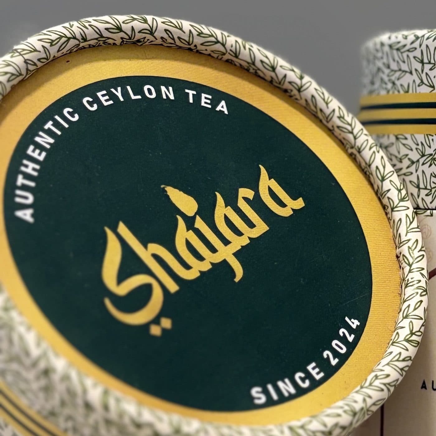
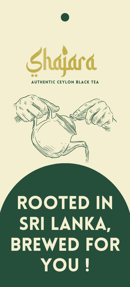
A calligraphic wordmark: Latin letters drawn with the rhythm of Arabic script, set in gold on Shajara green and warm cream.


شجرة
Shajara means “tree”.
A tree grows from a root, the way Shajara grows from Sri Lanka. The name holds the whole idea: something natural, something that lasts, something with a place it comes from.
- Tree
- Growth
- Nature
- Tea
- Heritage
A system drawn from the leaf, the land and the cup.
- Shajara Green#254F3ALids, tags, headlines
- Leaf#517732The tea-leaf pattern
- Gold#C5AF46Wordmark and bands
- Cream#F4EFD1The ground
- Clay#8C756AThe arch frame




Every detail, a reflection of quality.
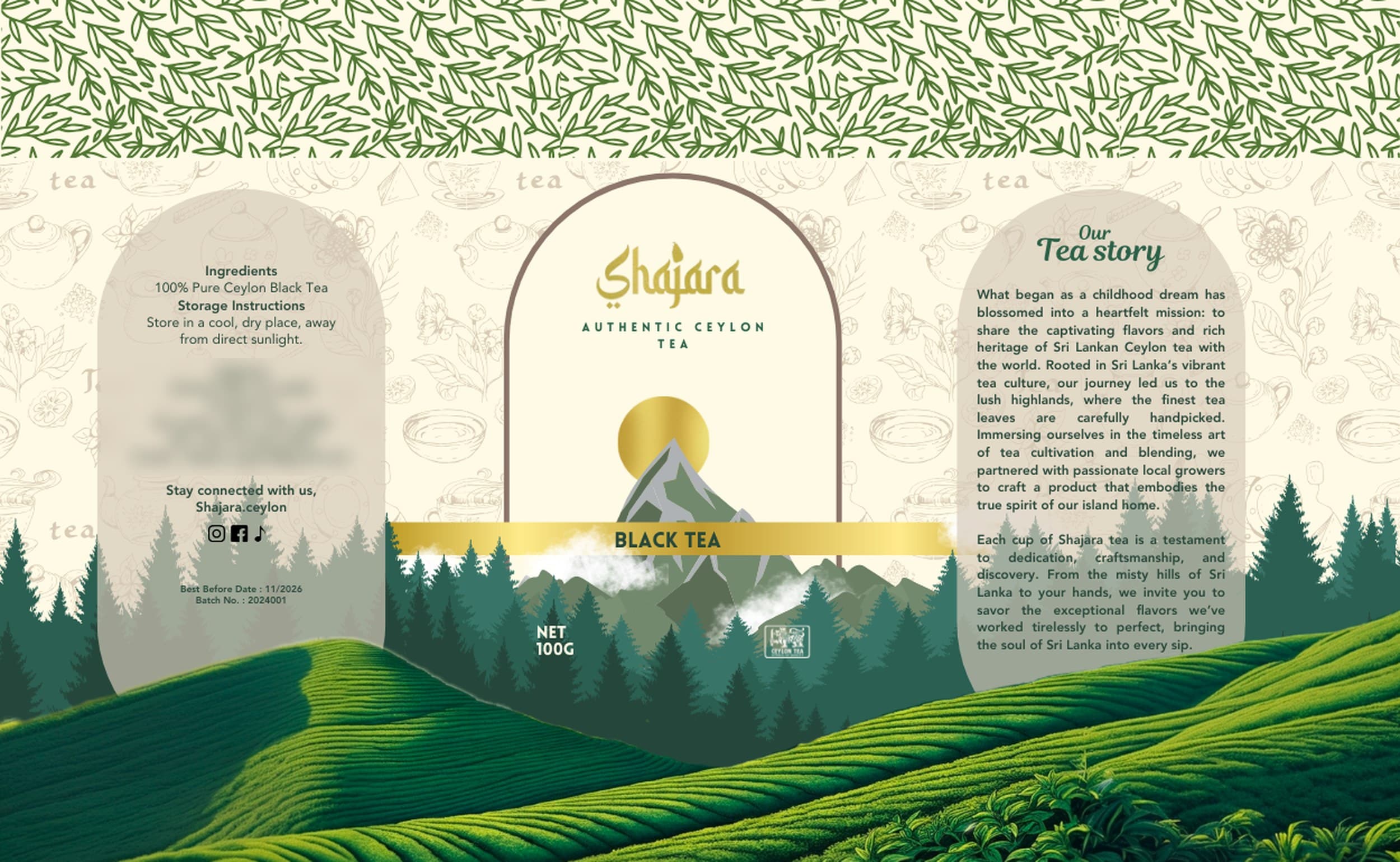
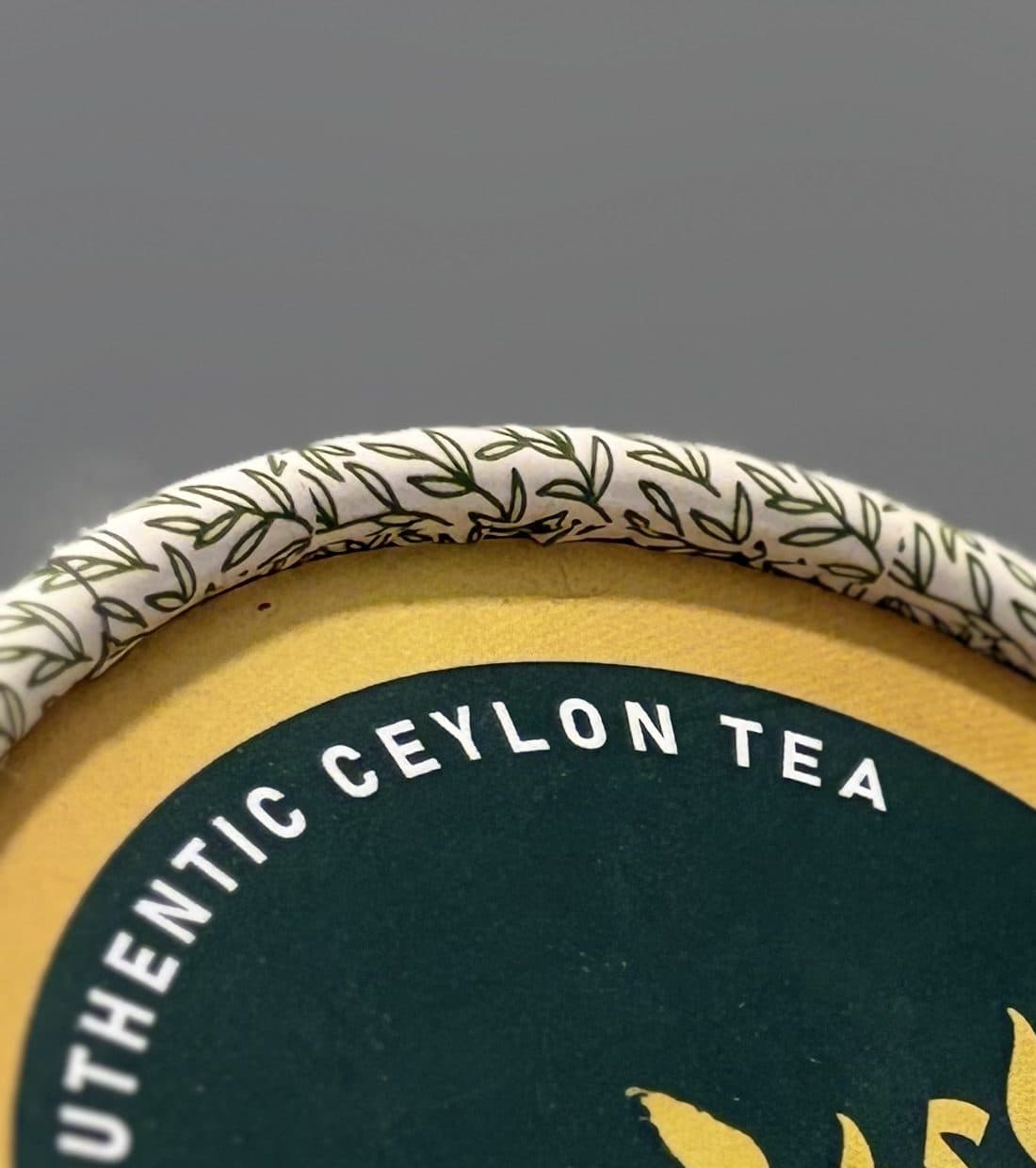
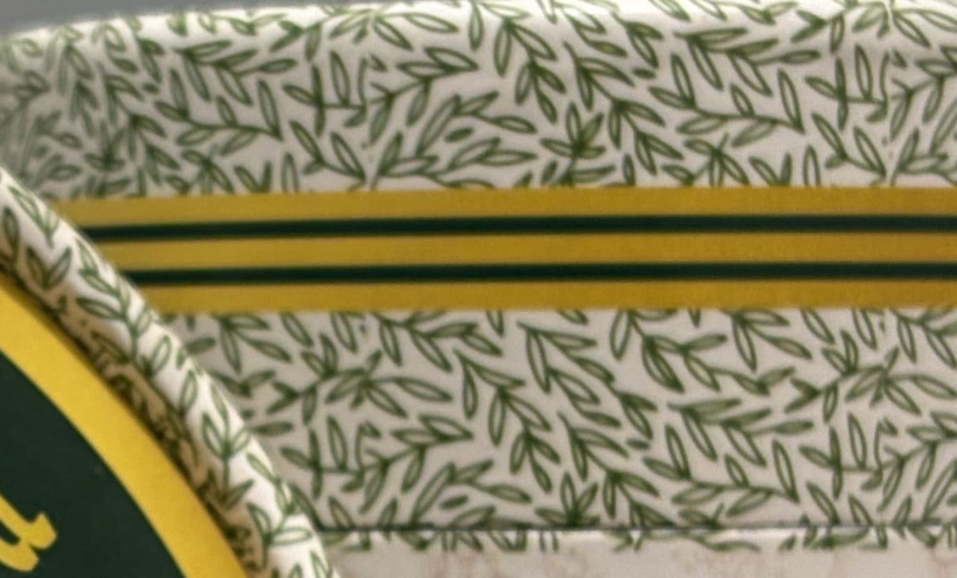
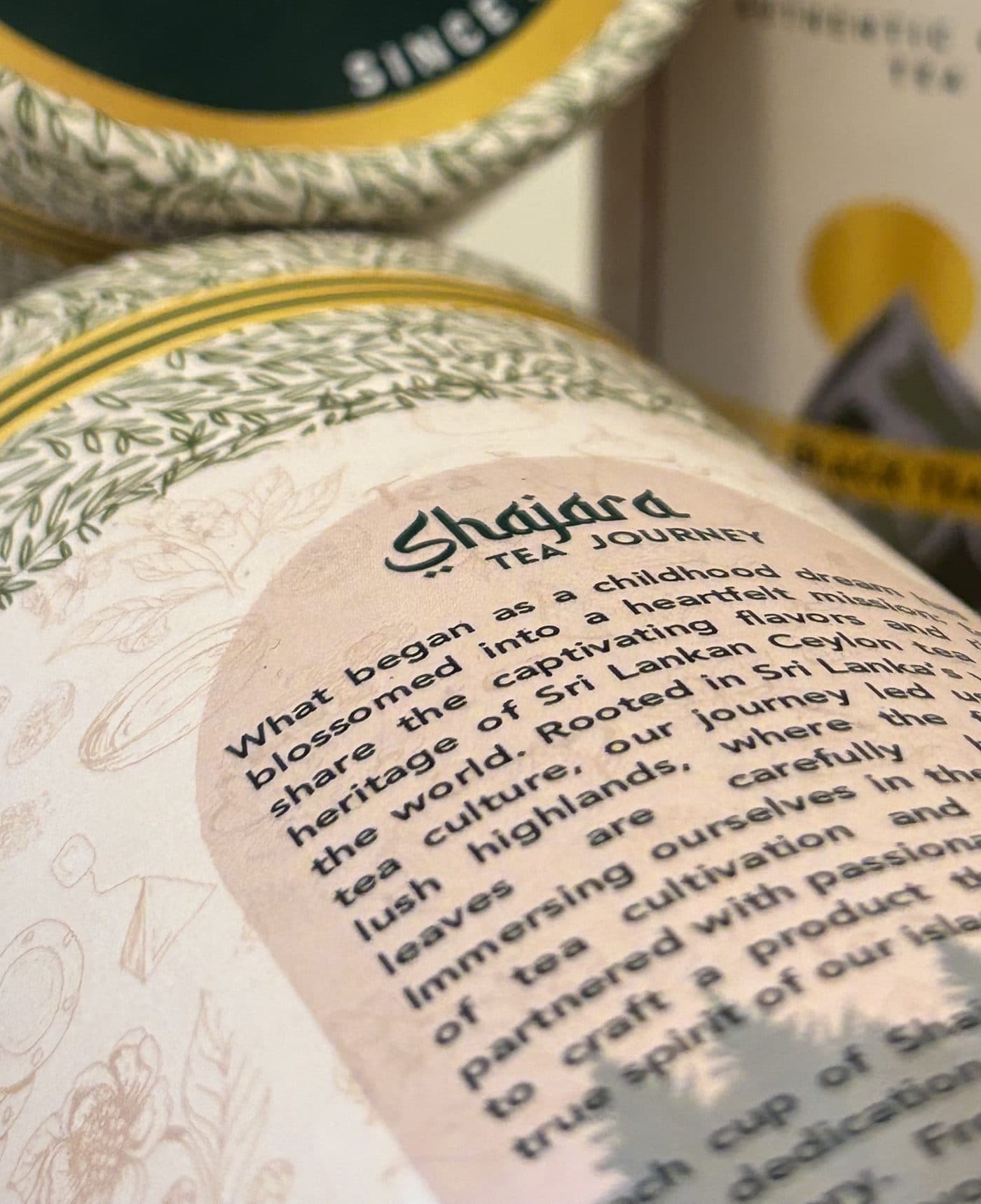
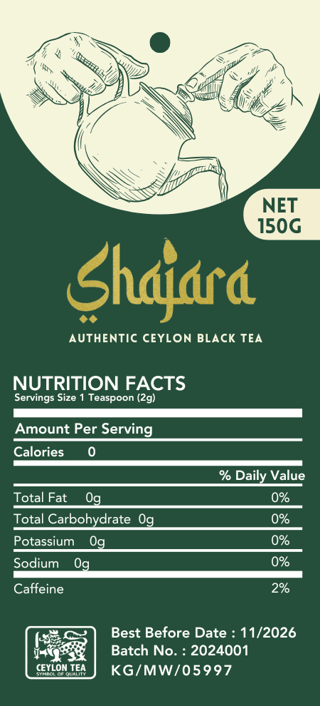
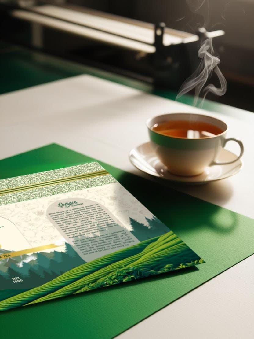
Paper canisters wrapped in a hand-drawn leaf pattern, banded in gold and capped in deep green. The label opens like an arch onto the Ceylon highlands, with Shajara’s own tea story on the back.
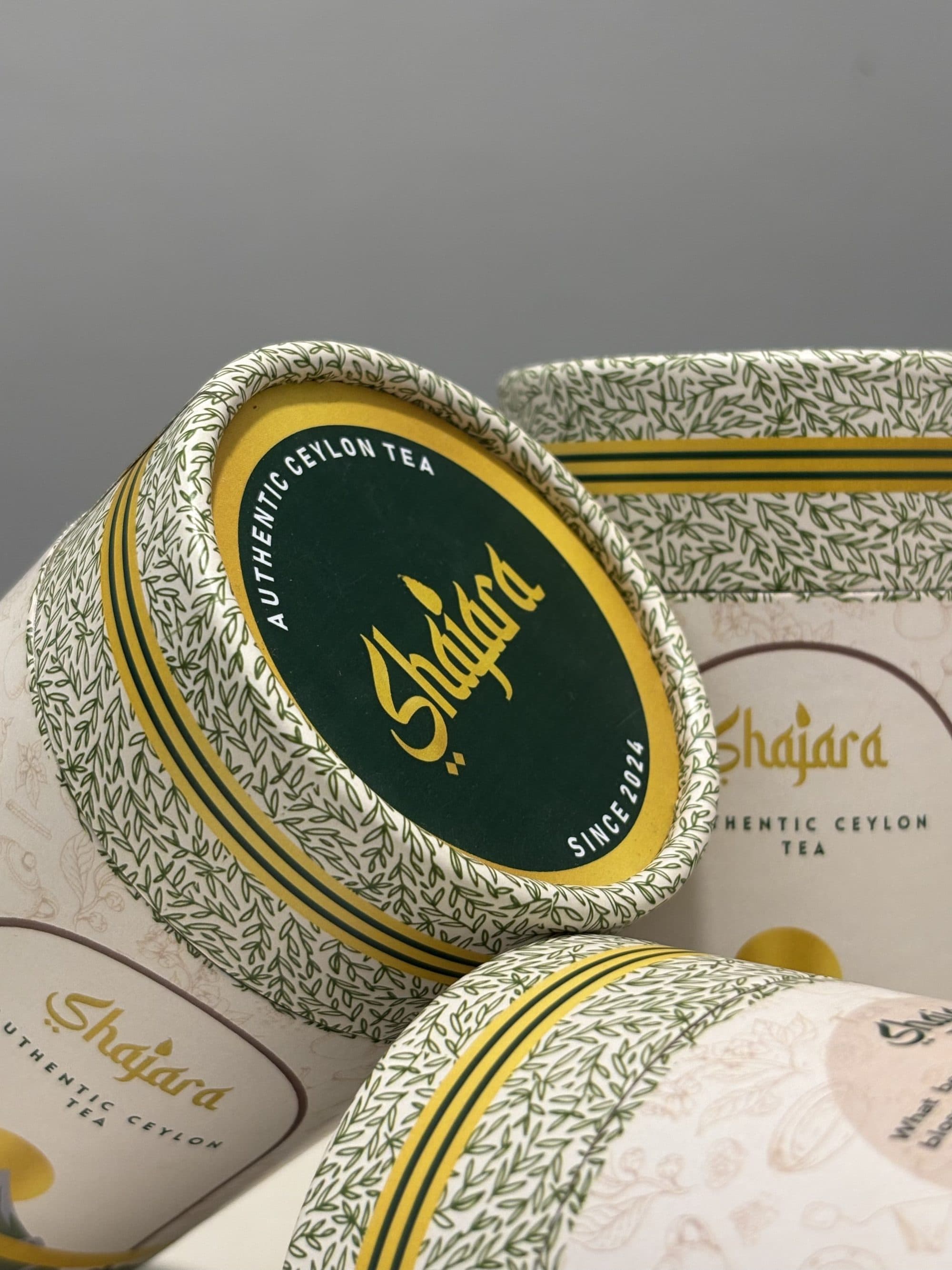
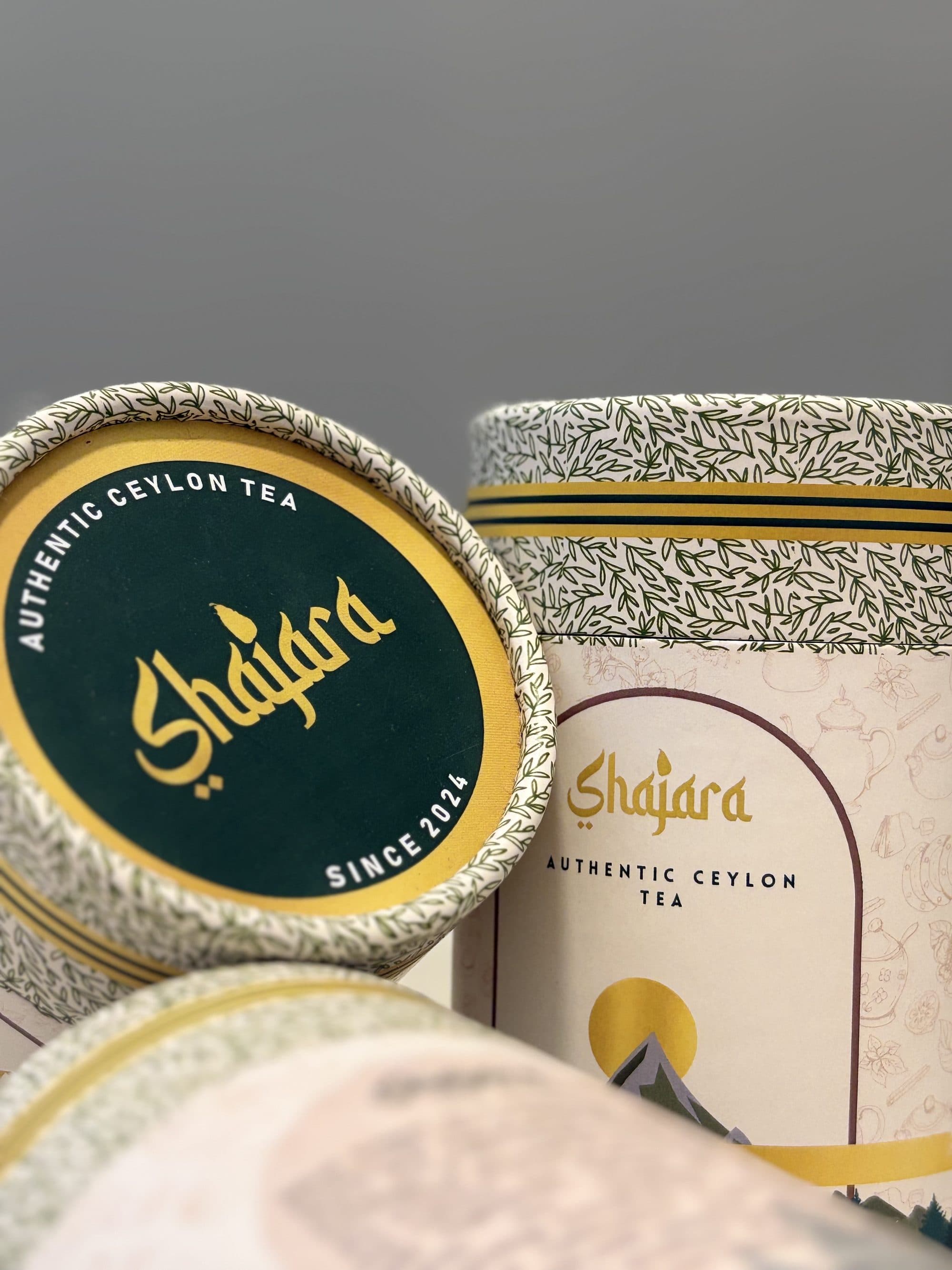
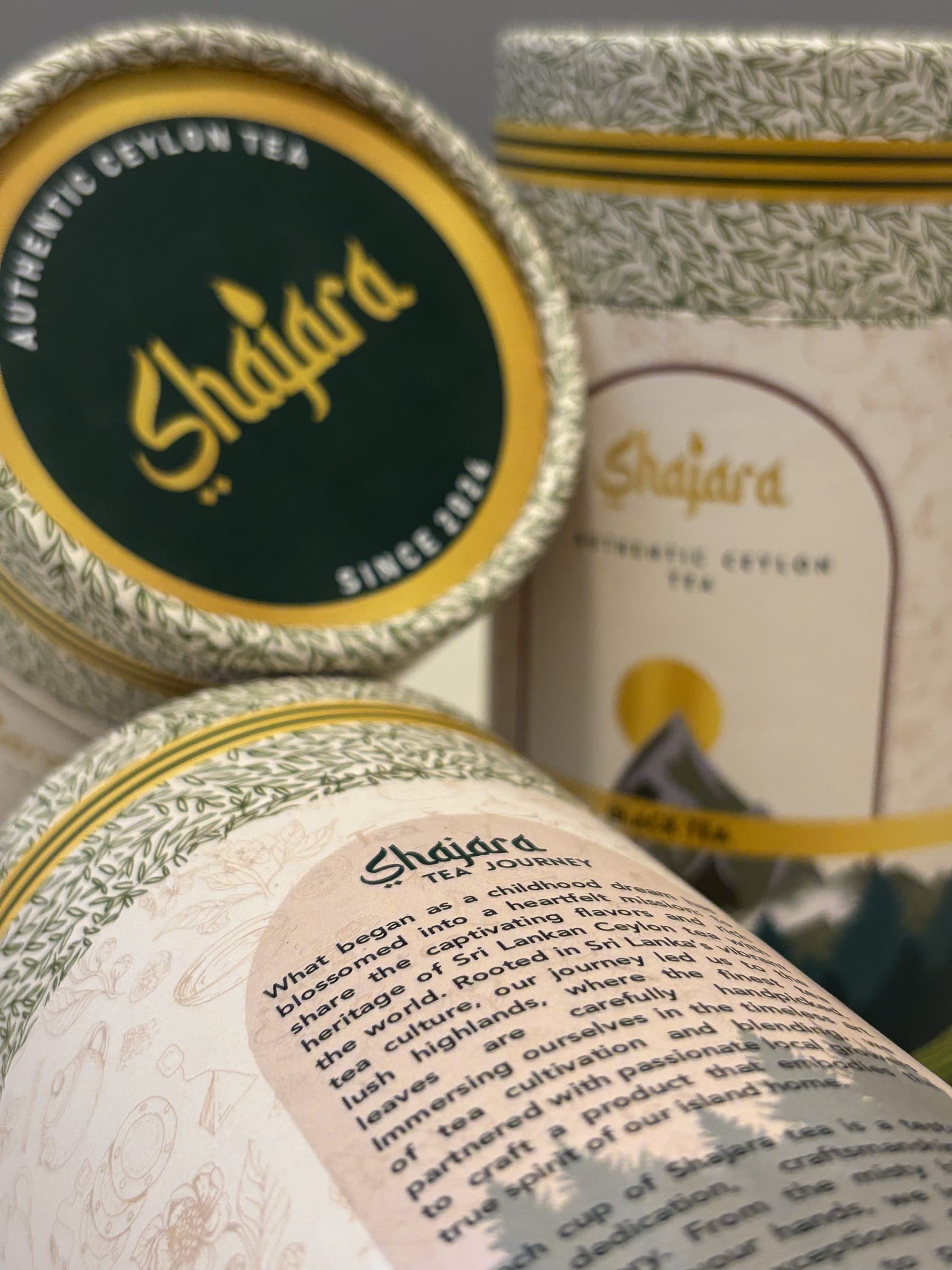
Made to be held.
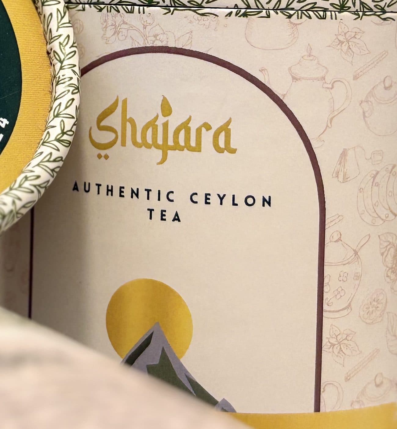
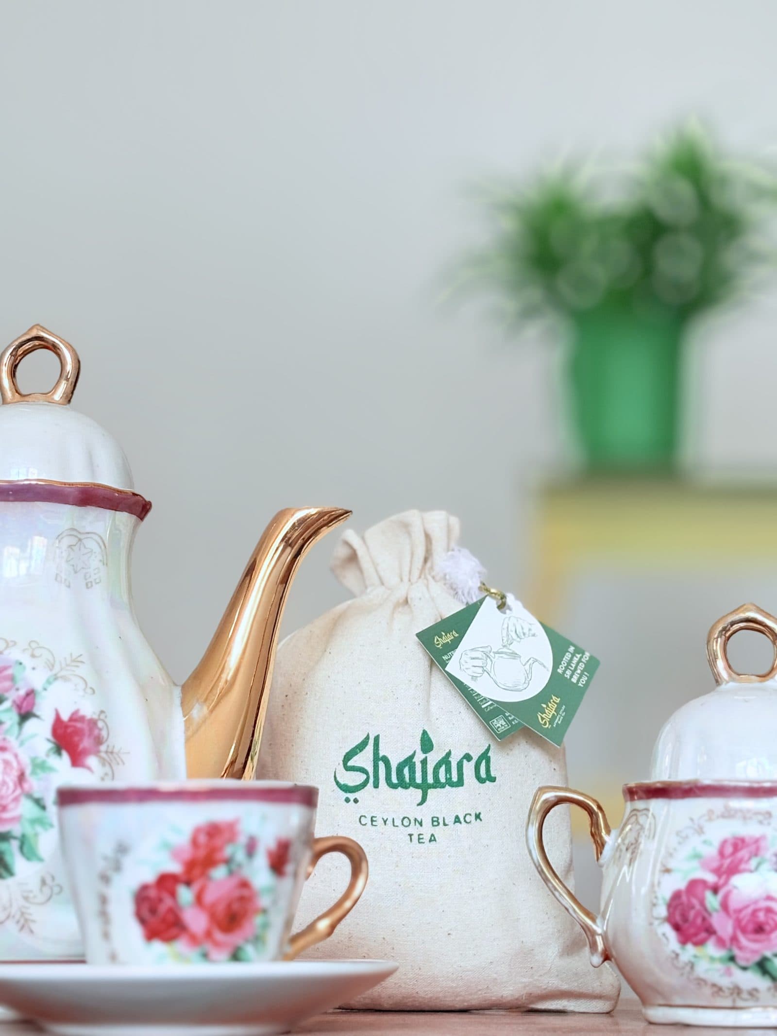
Visuals that tell a bigger story.
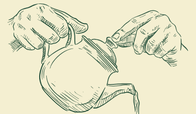
The photography places the product inside the ritual it belongs to: the teapot, the cup, the table, the pour. Every frame carries the same green, gold and cream.
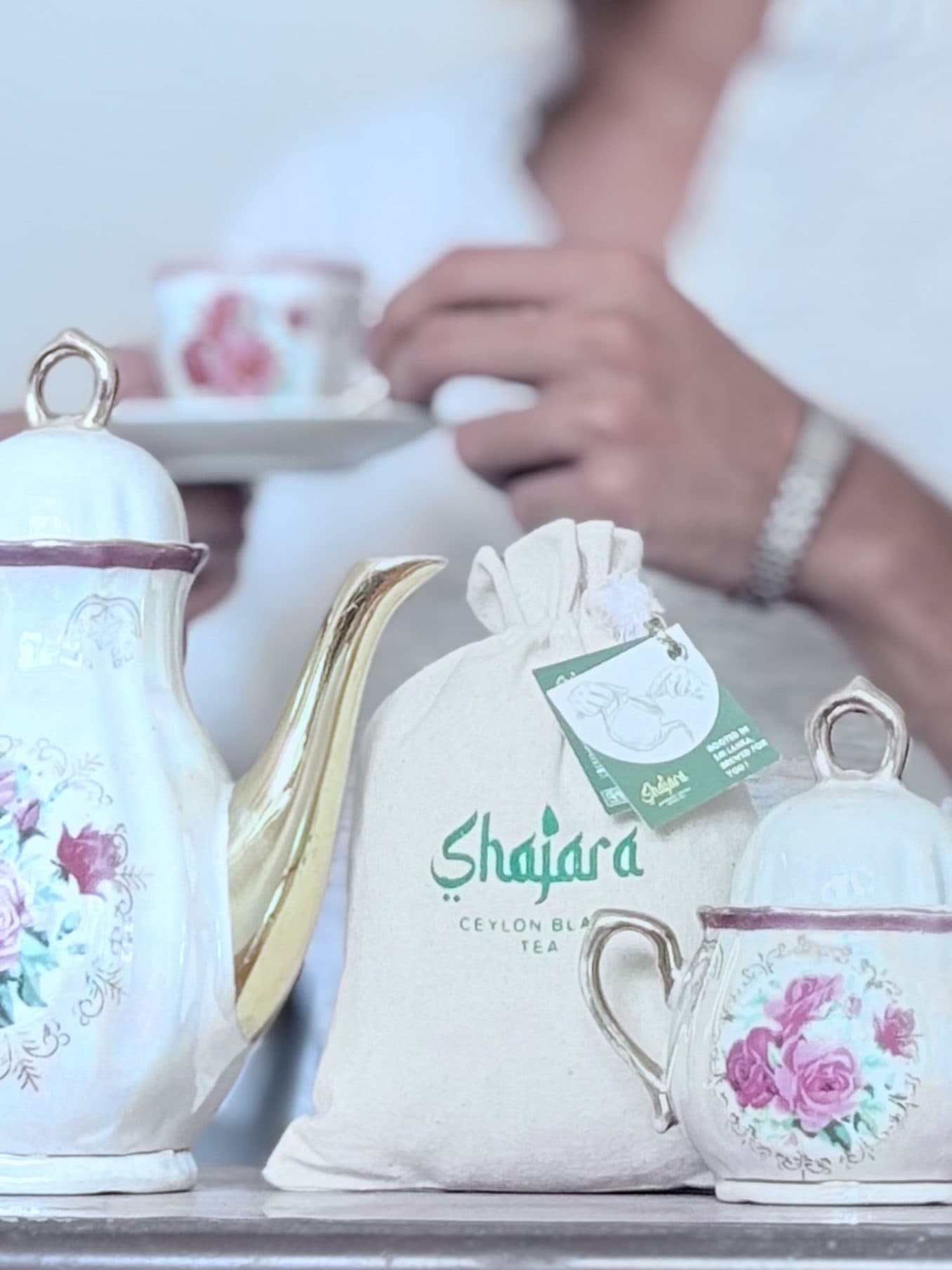
Quiet. Slow. Tactile.
A product film lit like a still life. The lid, the rim, the story on the label, then the canister standing in the light.
A cohesive presence across the feed.
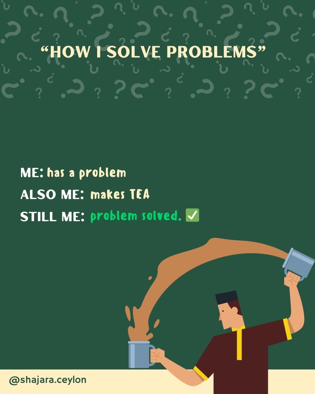
Launch announcements, product posts and lighter moments for tea lovers — all speaking the same visual language.
@shajara.ceylon ↗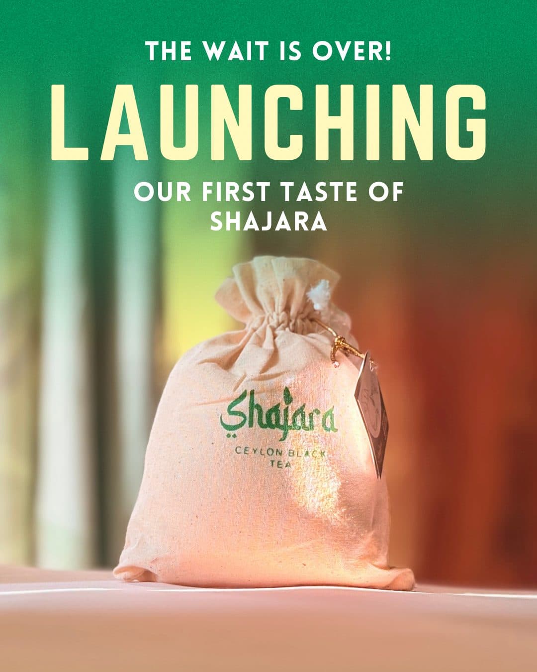
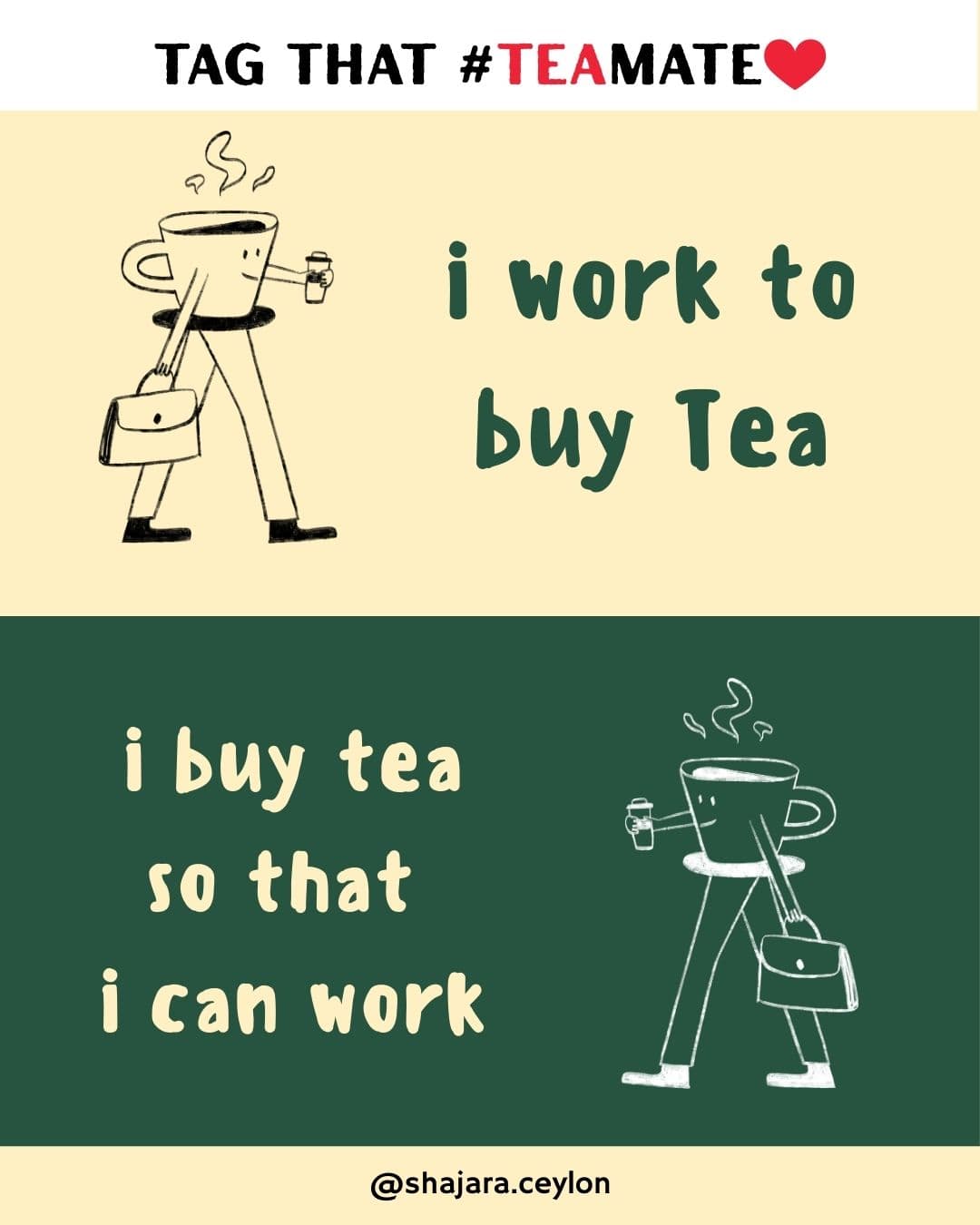
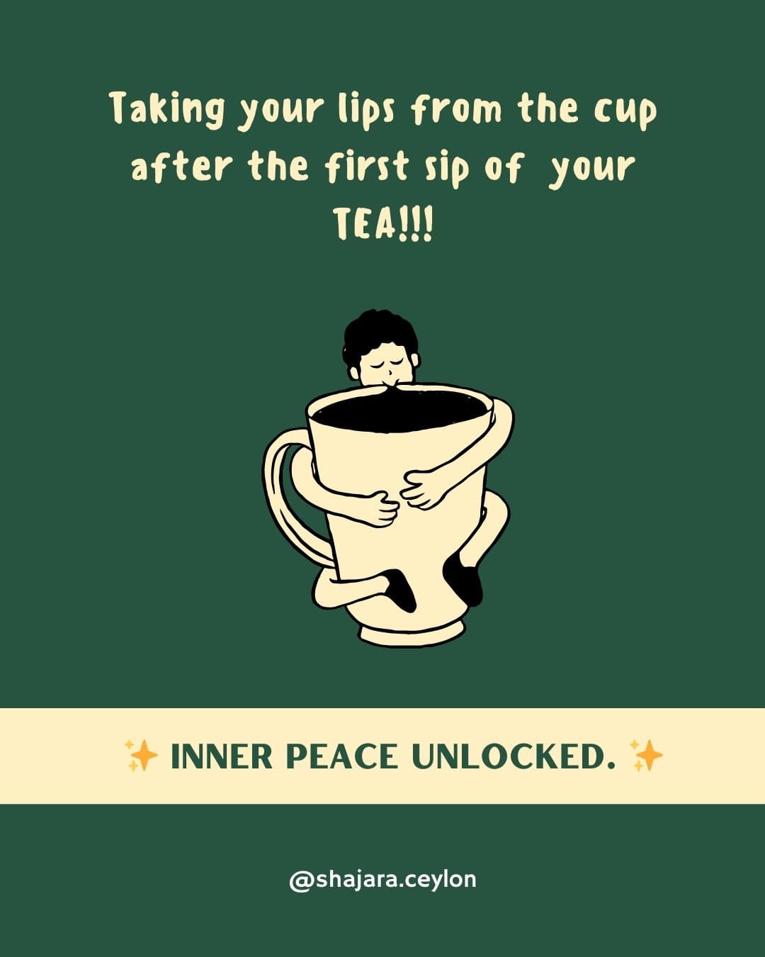
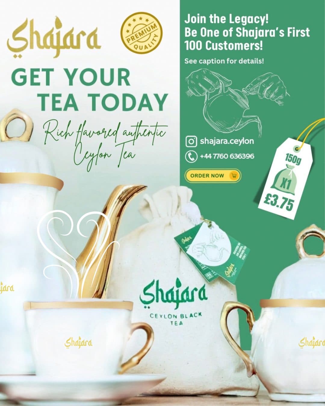
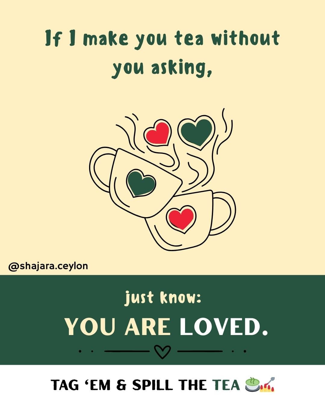

From identity to experience.
Not a logo with packaging attached. One world — from the lid to the label, the tag, the table and the feed.
- 01
- Brand identity
- 01
- Packaging system
- Social
- Content
- Reels
- & film
- Arabic-inspired logomark
- Wordmark
- Packaging system
- Tea labels
- Tea boxes
- Inserts
- Product photography art direction
- Social media posts
- Reels
- Voiceover-based content
- Ambient sound content
From the identity to the shelf, every touchpoint was designed to belong to the same world.
From a forgotten gem to a name that travels.
Shajara Tea
Brand/Packaging/Content
Framed Splendor
- E-commerce Development
- /Brand Identity
- /Logo Design