Case notes20261 min read
One brand, two cultures: designing Shajara Tea
How we built a Ceylon tea brand for the Middle East without making it look like either a souvenir or a costume.
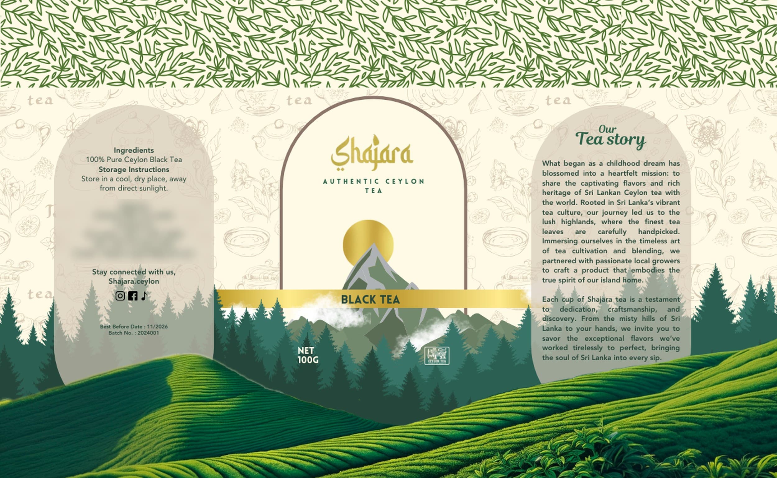
Shajara is Ceylon black tea made for the Middle East. The easy answer would have been to make it ‘look Arabic’. The brief was harder than that: find one visual language where three things could sit together naturally — Ceylon, the Middle East and modern luxury.
Start with the name
Shajara (شجرة) means ‘tree’. A tree grows from a root, the way Shajara grows from Sri Lanka. The name already held the idea: something natural, something that lasts, something with a place it comes from.
Let the letters carry both worlds
The wordmark is written in Latin letters, drawn with the rhythm of Arabic script — readable to everyone, familiar to the audience it was made for. Set in gold on Shajara green and warm cream, it feels considered rather than decorated.
The brief was never to make the brand look Arabic. It was to make it belong.
Put the origin on the pack
The label opens like an arch onto the Ceylon highlands, printed around every canister. The architecture speaks to the Middle East; the view through it leaves no doubt about where the tea is grown.
Read the Shajara Tea case study