Branding20251 min read
A brand system is a promise, not a logo
Consistency across every touchpoint is what turns a new business into a credible one.
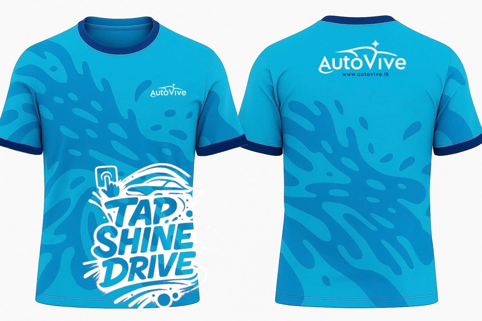
A logo is the smallest part of a brand. The system — type, colour, spacing, tone of voice — is what people actually feel across a website, an email, a social post, a uniform and a printed label.
When every touchpoint agrees, a new organisation reads as an established one.
Consistency is credibility. When the touchpoints don’t agree, even a beautiful logo can’t save you. That’s why we deliver systems, not just marks: colour, typography, spacing and usage guidelines — so the brand still holds together long after launch, whoever is using it.
For AutoVive, that meant one identity carried from the wordmark to the team’s uniforms, the launch posts and the investor pitch deck — so every piece told the same story.
See how it works for AutoVive